BRÜNN STUDIO
Architecture studio
"A conceptual demo that reimagines how an architecture studio communicates its criteria, methodology, and processes."
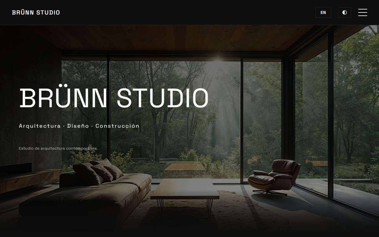
The starting point of the challenge
Digging beneath the surface: What did I investigate?
I analyzed numerous architecture studio websites and many shared the same problem: they looked good but explained very little. I found:
- Huge galleries with no context.
- Confusing navigation.
- Portfolios that looked like photography studios.
- An excess of aesthetics.
- Very little clarity.
- Overly generic contact forms.
- Sites that were visually attractive but difficult to understand from a UX standpoint.
I also noticed something important: many websites showcased projects, but didn't help anyone understand how the studio actually worked. It wasn't clear what approach they had, what type of projects they did, what the process was like, or even whether they were the right studio for that particular client.
"The problem wasn't just visual. Most studios already had "beautiful" websites. The problem was they weren't conveying criteria. They showed results without explaining decisions. It felt like someone could visit, see some nice images, and leave without truly understanding what the studio did or whether it was what they needed. So I decided to focus on clarity, context, and methodology — not just aesthetics."
Understanding this pillar completely transformed the tactical direction of the project, allowing unnecessary noise to be filtered out and focusing on strict value.
Tradeoff Analysis: options on the table
Building custom software requires honestly evaluating scenarios. No architecture is perfect — every decision has a price:
Traditional visual gallery
Visually attractive, but poorly differentiated and with little context about the studio.
Highly experimental layouts
Greater visual impact, but worse clarity and navigation.
Prioritize explanation and structure
Less immediate spectacle, but far better real understanding of the studio.
Pack the site with animations and effects
More eye-catching, but worse performance and more distraction.
The Decision: The path chosen
WHAT ACTUALLY WORKED
The project managed to convey a much clearer identity than many of the references I had analyzed. The combination of structure, content, whitespace, typography, and contextual explanation helped the site feel more human and understandable, without losing its contemporary and elegant focus. The balance between aesthetics and performance also worked well: I aimed to maintain an attractive visual experience without relying on heavy animations or unnecessary resources.
LIMITATIONS & TRADE-OFFS
The gallery prioritizes visual experience and narrative over advanced exploration. That helped keep the experience cleaner and more editorial, but sacrificed things like filters, deeper categorization, direct navigation between project types, and individual pages optimized for SEO. I also chose not to experiment too much outside the gallery. I preferred to maintain clarity and consistency over adding unnecessary visual complexity. Additionally, as a conceptual demo, many decisions were born from research and criteria, but haven't yet been validated with real users or usage metrics.
FROM GONZALO'S PERSONAL LOGBOOK: WHAT WOULD I DO DIFFERENTLY TODAY?
"I would better separate each project into individual pages to improve exploration, scalability, and SEO. I would also rethink part of the gallery to maintain the visual experience while making it easier to find specific projects. And I would probably go even deeper into the process and decision-making sections, because that's exactly what ended up most differentiating this project."
Retrospective note after launch