La Página de UXnicorp
The website that sells exactly what we do
"A custom-built platform that acts as a permanent demonstration of our criteria, speed, and commercial transparency."
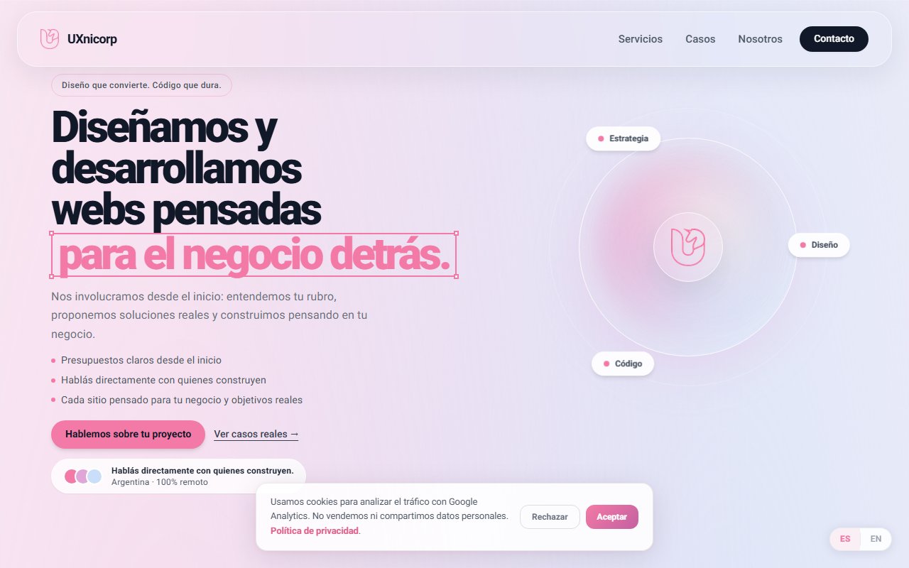
The starting point of the challenge
Digging beneath the surface: What did I investigate?
I analyzed sites of development agencies, design studios, senior freelancers, and product studios. I found three repeated patterns:
- They all looked too similar: corporate blue, generic dark backgrounds, stock 3D renders, and empty slogans. It was impossible to tell them apart.
- A lot of talk and little evidence: they spoke of "digital transformation" or "incredible experiences" but showed very little actual, structured work.
- Almost nobody showed how they worked: you could see what they did or how much it cost, but rarely the technical reasoning or how they made architectural decisions.
I understood that the site shouldn't act like a brochure — it should act as a demonstration. Every section had to prove something: the case studies proved expertise, the pricing transparency filtered leads, and the UX Score demonstrated our methodology.
"I wanted to convey approachability, criteria, honesty, technical capability, and a focus on results. The entire architecture, performance, and commercial clarity had to be an exact reflection of what we sell. I made an uncommon decision for development agencies: showing prices transparently on the website. Not as a generic "plans" table, but by explaining exactly what each type of project includes, how much it costs, and why. The hypothesis was that this would naturally filter incoming prospects — those just looking for a cheap price would self-select out, and those who valued quality would arrive with aligned expectations."
Understanding this pillar completely transformed the tactical direction of the project, allowing unnecessary noise to be filtered out and focusing on strict value.
Tradeoff Analysis: options on the table
Building custom software requires honestly evaluating scenarios. No architecture is perfect — every decision has a price:
No-Code platforms (Webflow, Wix)
Advantage: shorter development time. Disadvantage: contradiction that's hard to justify (selling custom development using a third-party visual builder) and technical limitations for interactive tools like the UX Score.
Next.js with custom development
Advantage: total technical control, dogfooding our own stack, extreme optimization, and absolute freedom to create interactive tools. Disadvantage: longer development and maintenance time.
The Decision: The path chosen
WHAT ACTUALLY WORKED
The website ended up being the studio's best calling card: it shows what we advise in practice, rather than just describing it. The UX Score also acted as a filter - people who reached out already had a diagnosis in mind, which raised the quality of first conversations. The pricing transparency worked the same way: someone with a budget far outside our range could self-filter and not take up a meeting. And the page served as a living portfolio - every visit was already an experience of the work itself.
LIMITATIONS & TRADE-OFFS
Developing and maintaining a custom site consumed more design and coding time than a no-code solution. The animations with Framer Motion and Lenis smooth scroll added to the initial bundle weight, requiring extra optimization to keep good Lighthouse scores. Manual internationalization required structured maintenance. And the UX Score, being so visible on the page, required constant attention to avoid becoming outdated.
FROM GONZALO'S PERSONAL LOGBOOK: WHAT WOULD I DO DIFFERENTLY TODAY?
"I would improve the internal analytics system to more precisely measure user behavior within the UX Score funnel. I would design a dynamic content system to add a blog or technical notes without manual deploys. I would refactor the translation structure to support more languages in a modular way. And I would probably reconsider some animation decisions to reduce dependency on external libraries in sections where pure CSS would suffice."
Retrospective note after launch