LÜMEN
Interior design studio
"A case study on emotional design and digital habitability brought to the website of an interior design studio."
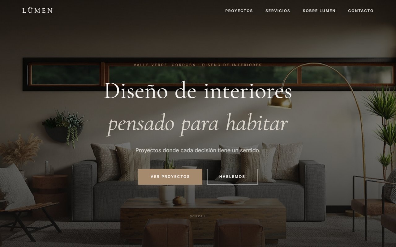
The starting point of the challenge
Digging beneath the surface: What did I investigate?
I analyzed numerous interior design websites and detected several repeated patterns. Many projects were built almost exclusively around the visual — pleasant galleries, polished renders, "Instagrammable" spaces. But once again, the same problem appeared: there was very little explanation behind the decisions. Everything felt very decorative, but not very livable. I also found a very strong tendency to show inspiration but not process, criteria, or methodology. In many cases: all projects felt the same, there was no clear studio identity, the content seemed put together just to look good, and the experiences ended up feeling cold or impersonal.
"In architecture, the focus had been on explaining structure, methodology, and clarity. In interior design, it was different. This wasn't just about designing functional spaces — it was about conveying how it feels to inhabit them. I understood that the website experience itself also needed to feel inhabitable. The rhythm, the whitespace, the navigation, the tone of the text, and the way you moved through the page all had to generate calmness, sensitivity, and warmth. I didn't want the site to just look good. I wanted it to feel pleasant to move through."
Understanding this pillar completely transformed the tactical direction of the project, allowing unnecessary noise to be filtered out and focusing on strict value.
Tradeoff Analysis: options on the table
Building custom software requires honestly evaluating scenarios. No architecture is perfect — every decision has a price:
Traditional visual portfolio
Simpler to build, but too similar to most references and lacking real differentiation.
Extremely minimalist approach
Visually elegant, but too cold for the type of emotional experience I was seeking.
Prioritize storytelling and atmosphere
Less information density, but a more coherent and emotional experience.
Design each project with a completely different visual identity
More individual personality, but risked breaking the studio's overall coherence.
The Decision: The path chosen
WHAT ACTUALLY WORKED
The project managed to convey a much warmer and more inhabitable feeling than many of the references I had researched. The visual rhythm, the sense of calm while navigating, the hero section, the consistency of the language, and the relationship between whitespace, typography, and content all worked especially well. I also felt the site achieved something important: making the design feel not just decorative, but thoughtfully crafted around how someone inhabits a space.
LIMITATIONS & TRADE-OFFS
I prioritized atmosphere and sensation over information density. That helped keep the experience cleaner and more pleasant, but also meant some parts of the site have less technical depth or advanced exploration. Another significant limitation was that the projects still didn't have a sufficiently personalized visual identity. The original idea was for each project to have its own palette and internal mood, without breaking the studio's overall mood. That would have deepened the sense of habitability and differentiation enormously, but it remained pending because it depended on final visual material that was never developed. I also chose to keep layouts relatively conservative so as not to disrupt the site's overall calm. I prioritized emotional coherence over excessive visual experimentation.
FROM GONZALO'S PERSONAL LOGBOOK: WHAT WOULD I DO DIFFERENTLY TODAY?
"I would work much more on the individual identity of each project, especially through color, atmosphere, and visual direction. I would also go even deeper into the idea of "inhabiting" as an emotional experience, because it turned out to be a much harder aspect to resolve than I expected. In this project, I learned something important: in emotional design, small changes in rhythm, tone, or composition can completely break the feeling you're trying to build. And I would probably explore more subtle forms of visual customization so that each space has its own identity without losing coherence with the rest of the site."
Retrospective note after launch