STRØ ATELIER
Author architecture studio
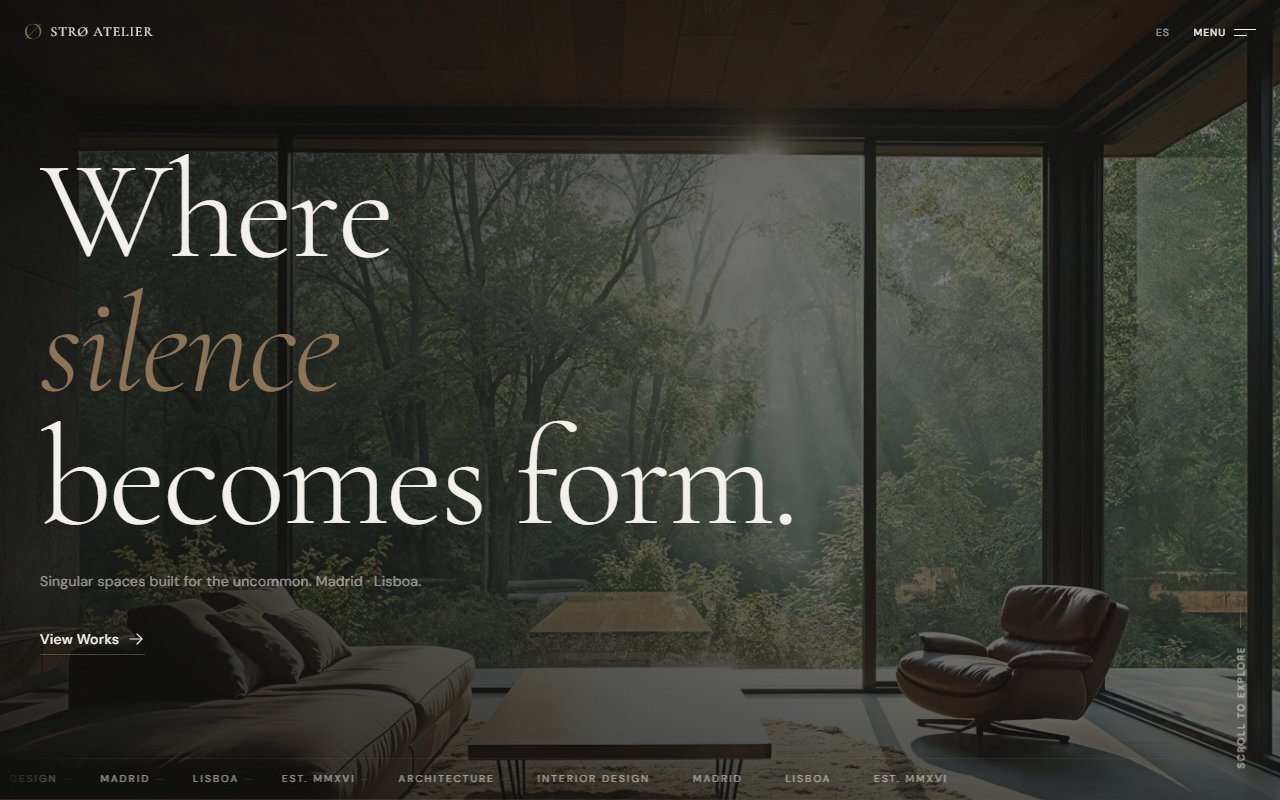
"How to translate the sophistication, visual silence, and inevitable character of contemporary author architecture into a digital language."
The starting point of the challenge
Digging beneath the surface: What did I investigate?
I analyzed European architecture and interior design studios, especially references from Spain, Portugal, Belgium, and Japanese minimalist studios. I found very repetitive patterns:
- Extremely generic minimalism.
- An excess of renders without narrative.
- Rigid and predictable grids.
- An overly corporate tone.
- Sites that looked like render catalogs.
- Cold and distant interfaces, with projects shown as visual assets rather than architectural decisions.
I also found another problem: many tried to look "premium" by adding unnecessary complexity — exaggerated transitions, experimental scrolls, hard-to-navigate layouts, barely legible typography. It felt like the website design was competing against the architecture instead of supporting it.
"I understood that to convey author architecture, you didn't need to overdesign. You needed control. Visual silence. Rhythm. Restraint. Hierarchy. Spaces that breathe. The experience had to feel precise, almost like an architectural editorial publication. I also understood something important: contemporary architecture isn't sold just by showing the final result. It's sold by showing criteria. That's why the project started revolving around decisions, materiality, process, intention, architectural direction, and spatial narrative — not just beautiful images."
Understanding this pillar completely transformed the tactical direction of the project, allowing unnecessary noise to be filtered out and focusing on strict value.
Tradeoff Analysis: options on the table
Building custom software requires honestly evaluating scenarios. No architecture is perfect — every decision has a price:
Ultra-minimalist experience
Conveyed sophistication and visual silence, but risked feeling empty or inaccessible.
Much more experimental design
Generated immediate visual impact, but hurt clarity, navigation, and readability.
Architectural editorial aesthetic
Less explosive impact, but far more coherence, identity, and presence.
Traditional grid-based portfolio
Simpler and more functional, but lost personality and differentiation.
The Decision: The path chosen
WHAT ACTUALLY WORKED
I feel STRØ managed to convey a much more solid and authorial identity than many real studios I researched. The visual control, the reading rhythm, the editorial sensation, the art direction, the coherence between architecture and UI, and the contemplative narrative all worked especially well. I really liked how the site manages to feel premium without relying on exaggerated effects. The experience leans much more on composition, spacing, tone, hierarchy, and structure than on animations or visual artifices. Besides, I think it was one of the first projects where I truly understood that designing is also about knowing how to hold back.
LIMITATIONS & TRADE-OFFS
The pursuit of sophistication and visual silence came at a cost. At times, the site prioritizes atmosphere over exploration speed. The navigation isn't optimized for fast consumption — it's designed to be moved through calmly. I also sacrificed more commercial functionalities like advanced filters, search, fast project exploration, aggressive CTAs, and high information density. Another tradeoff was the tone: the philosophical and contemplative language helps enormously to build identity, but it also means the project speaks to a very specific type of client. I feel I still could have explored more how to combine editorial brutalism and contemporary UX without losing clarity.
FROM GONZALO'S PERSONAL LOGBOOK: WHAT WOULD I DO DIFFERENTLY TODAY?
"I would work even more on the interactive dimension of the project. I'd love to explore more architectural transitions, micro-interactions related to space and materiality, more immersive navigation, subtle rhythm changes between sections, and motion more integrated into the narrative. I would also go deeper into the visual system for projects, so each work has even more individual identity without breaking the studio's global coherence. And I would probably reconsider some aspects of accessibility and readability, because part of the aesthetic pursuit pushed certain contrasts and typographic sizes to the limit."
Retrospective note after launchWHAT THIS PROJECT DEMONSTRATES
STRØ demonstrates my ability to design sophisticated editorial experiences with extreme visual restraint, controlling rhythm, hierarchy, and atmosphere through composition, typography, and silence. It also demonstrates my understanding that designing isn't about adding — it's about deciding what won't appear — and my skill at translating analog disciplines like author architecture into digital language without trivializing them or turning them into generic templates.